GO PLATINUM
Credit cards have been quite popular for some time with the usage of points and perks to help complement a person’s lifestyle. The Platinum Card from American Express went through a product refresh and it’s only right that it deserves a more “platinum” feel.
OVERVIEW
PROJECT American Express Platinum Card Refresh
TIMEFRAME Feb. 2021 - Jun. 2021
ROLE Senior UX / UI Designer
TOOLS Sketch / InVision / Freehand
CHALLENGE Users were experiencing lengthy copy fatigue and were having a hard time finding information they needed to help them make a decision on whether to apply or not. Marketing also wanted to bring a more "premium experience” to the details page.
For this project, it required complete collaboration from multiple cross functional teams across the organization such as product owners, marketers, developers, brand, and legal/compliance. Because the Platinum Card was going through a product refresh with completely new benefits and perks, the scope of the work required us to re-design the product details page to reflect the “platinum and exclusive” feel of what the card wanted to portray, and to solve the problem of lengthy copy fatigue.
Myself and two other designers from the Card Shop & Acquisition team were given roughly two weeks to come up with initial concepts where we brainstormed and conceptualized possible designs that could be potential solves. Before we began to create wireframes, I gathered research and inspiration from various sites that I found to be doing well with wordy content. I went back and forth with key stakeholders, presenting and gathering feedback on what worked well and what didn’t work well. After sifting through different design variations, a vote was casted to see which design would be pushed forward for production. My flippable card tile design was selected for production and is now live on the site. These new components for American Express will also most likely be recycled and reused in the future for the suite of Cards that AMEX has.
The revamped product details page proved to be successful with users during testing, highlighting that it was much easier to find the information they needed through the new interactive components versus reading paragraphs and paragraphs of copy. They also felt that the re-designed PDP page was more modern and approachable compared to other credit card sites.
Post launch (July 2021), the Platinum Card details page saw an increase in traffic by 3X, along with Prospect New Accounts Acquired having an increase of 34% (desktop) and 46% (mobile). The benefit tiles alone had a 14% increase in interaction. On the Cardmember side, the Platinum X-Sell NAA increased by 23%, Platinum Upgrades increased by 18%, and Platinum Supplementary Cards increased by 50%. Card Shop revenue also increased by 19% from $22.8M to $27.2M. The results were all positive from a business perspective as well as a UX design perspective.
MY ROLE
Ideate and conceptualize new solutions for the Platinum details page
Conduct workshops with stakeholders to show direction and progress
Follow up with stakeholders to make sure the build is going smoothly
GOALS
Redesign the Platinum Card details page to elevate it into a more premium feel
Solve for cognitive overload
Bring in new ideas and components that can be reusable for Card Shop
DELIVERABLES
InVision concept mockups and final buildkit
Mobile intro module animation
RESEARCH, STRATEGY, AND DESIGN THINKING
This was one of the first big projects during the pandemic and to get things started, myself and the other design leads wanted to make everyone involved feel at ease, considering this was the first time our stakeholders used an online collaboration tool. All project participants were asked to do a warm-up exercise where they had to define themselves as a premium lifestyle brand or experience. This was done by drawing a quick sketch, taking a screenshot of a website, finding products, or even coming up with a tagline. I noticed that our non-design stakeholders really enjoyed the session because it was effective, organized, fun, and most importantly, we brought them into our world and gave them an opportunity to be involved with our design thinking process.
Because this was relatively a “big sky” project (but still staying in line with the Platinum Marketing Team’s guidelines) within a short time frame, our stakeholders worked closely with us to define our goals from a design, product, and development stand point. Using sticky notes, all collaborators wrote down what our goals should be and what concerns or risks we may have. This helped us to make sure the team was aligned on priority and focused on building the best product given our constraints - time, development capacity, and legal/compliance. We then transitioned into doing a “How Might We…” exercise where we wanted to stretch our minds for innovative thinking, suggesting that a solution is possible. The team had many “how might we” notes, but it also showed us that there were themes among the many different ideas. From here, we separated the notes, organized, and bucketed them into the most common themes to help us prioritize, which were:
Premium lifestyle
Maintain travel legacy
Exclusive and desirable
Easily digestible
Premium product page/build
When it was time to conduct some research, we looked at competitors and various sites that are from different industries to see who was doing well with displaying heavy chunks of information, while also selling a “premium experience.” From Rolls Royce to cigars and everything in between, all findings were brought into InVision’s Freehand tool so that our team could compare and make notes on what we thought worked well and didn’t work well.
IDEATE
During this stage, I took all notes and feedback from our design thinking sessions to come up with quick sketches and mockups. Not only that, we have past data surrounding how the product details page performs so this was also taken into consideration. This took about 2 weeks going back and forth between working on the concepts and having small get-togethers with the other design leads so that we have extra sets of eyes providing feedback on our ideas and if it makes sense. Some of things that I worked on during this time:
Sketching
Wireframing
Bi-weekly sync ups
Create and animate prototype
SKETCHING
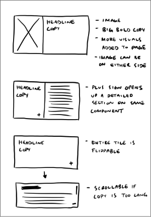
Usually before I start something that's net new, I like to sketch ideas on my iPad. I'll also write down any notes to complement the sketches so that I don't forget what I was thinking at the time. When I was in this stage of the design process, I asked myself:
Am I solving for long amounts of copy?
Am i addressing all of the themes we wanted to prioritize?
Will this be too complicated to build?
Is this modern and premium enough to enhance the users’ experience?
WIREFRAMES - ROUND 1
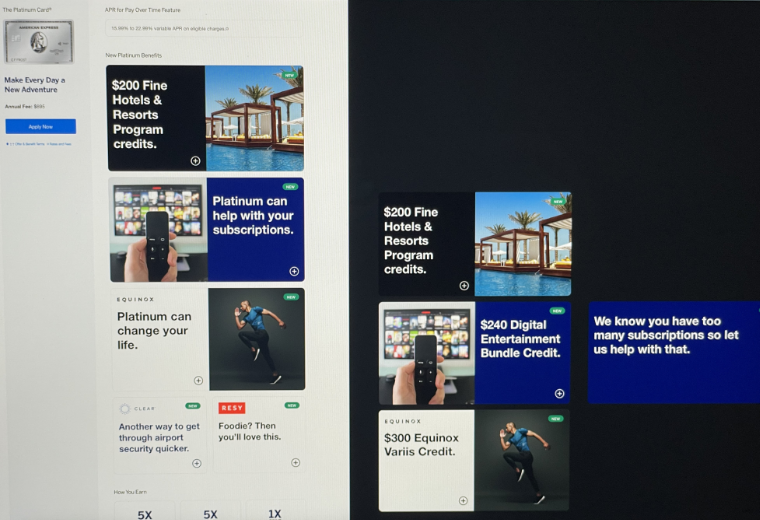
After the initial sketches, I began to create wireframes that were in higher fidelity so that they would be in a more presentable format with our cross-functioning teams. This stage of the design process allowed us to see the designs in a tangible and understanding way. The thought process behind these wireframes were to break up information into components/sections that were easier to find and read. Not only that, we wanted the page to feel modern and premium by introducing more visuals, engaging interactions, and a darker color scheme. I also wanted to highlight how the components could look with big bold copy that's more emotional and relates to users by speaking to them in a more conversational approach.
Based off of feedback, our stakeholders liked most of what was conceptualized and how information was grouped and presented. Even though feedback was mostly positive, I had to take a step back by not changing too much of the page. Changing it drastically wasn't feasible for our dev team.
WIREFRAMES - ROUND 2
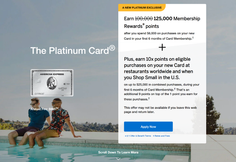
This round was much more realistic for our stakeholders. So what changed? The intro module changed to a variation of something we've done in the past except using a bigger image of the card. I got rid of the dark colors and stayed in-line with what existed before. The components are still flippable but assisted with an image to grab the users' attention and help tell the story. Along with my design, there were two other concepts from my fellow designers as well. My proposed design direction was chosen to move forward with. Some of the positives from this round were:
Flippable components were well received and kept
Intro module with captivating image was well received
Stakeholders liked that the concepts included more visuals that were related to the message
Everyone felt that these concepts provided a premium feel, matching the level of the Platinum Card
WIREFRAMES - FINAL
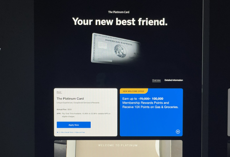
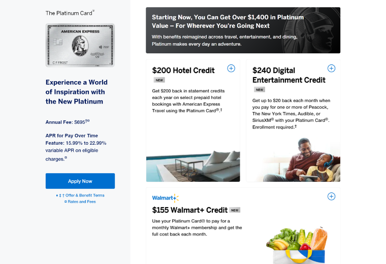
After all of the meetings we've had going back and forth with stakeholders, a finalized design was agreed upon for build. Marketing and product insisted to add in an offer component on the intro module so that was done. I also matched the flippable components to fit in with the lightness of the page. I originally wanted as less copy as possible to be showing on the front side of the component, but legal/compliance pushed back saying that the extra supporting copy was needed. We also opted out of using smart/emotional messaging. Instead we went with numerical values to help users see the value of the card in relation to the annual fee. This was then put into InVision as a prototype to use in a usertesting.com session.
I believe it still works and doesn't overwhelm the user. Myself and the rest of the team believe that this page improves scannability, provides more engagement with the usage of subtle interactions and visuals, and gives the Platinum Card a premium details page experience.
SO WHY THESE SOLUTIONS?
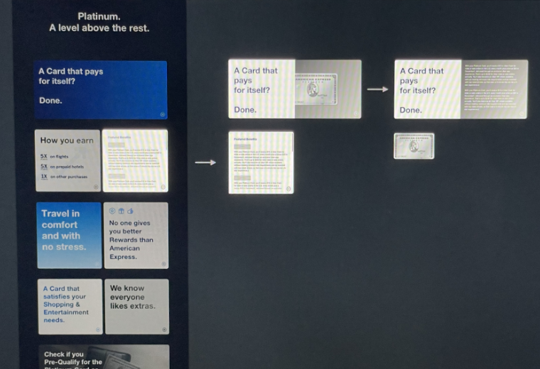
FLIPPABLE COMPONENTS
A possible solution to users experiencing information density when reading
Reduces copy but it can still house lengthy information when flipped
Supports marketing and product business goals with personalization and prioritization hierarchy
Added visuals and interaction to aid in engagement
Reusable component for the Card Shop and Acquisition pages
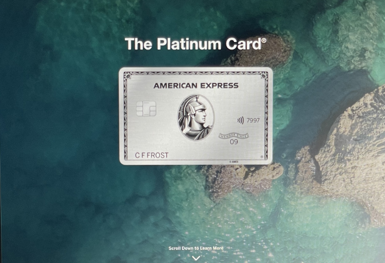
INTRO MODULE
I wanted the focus to be on the beauty of the card, nothing else
Often times, premium or luxurious products are the main focal point with great imagery supporting it (ex. a magazine spread)
The card would have some type of animation or movement to “premiumize” it
A great card needs to have a great first impression
TIME TO PUT IT TO THE TEST
Our UXR team took the InVision prototype for both desktop and mobile to a usability test with 13 participants total. We wanted to assess how well (or not well) the newly designed page would perform, and gain qualitative feedback for: scannability, look and feel, intro module animation, appetite for consuming benefit highlights vs. desire to flip over the tile to learn more, usefulness of the new "total value" module, and the unboxing image from a reinforcement banner.
Overall, the entire PDP design was received positively as participants agreed that the page sold them on the "premium" experience of the card.
Annual Fee Justification: The information on the page provided participants with a good overview of what they can expect with this card and convinced them that the benefits would offset the annual fee.
Intro Module: This was very well received as it provided participants with a good first impression of the card.
Benefit Tiles: Participants responded positively to the layout of the benefit tiles, and found that they were able to easily scan and access additional information.
“I really like the layout. I really like that it’s separated out in boxes. It makes it really easy to read and skim over. I don’t like it when text is clumped all together. To me this is very visually pleasing and makes it easy to navigate down to the other features in a natural way.”
“I like that I can learn more without having to go to another page... that whole flipping tile thing.”
“It was very premium. It feels exactly like I’m looking for a Platinum Card.”
LAUNCHED IN JULY 2021 AFTER POSITIVE FEEDBACK FROM USABILITY SESSIONS
*Note: The intro module was supposed to have animation but due to tech constraints, we weren't able to build it out to go live. Instead we decided to just show a static intro module with the card name, card, and offer box.
POST-LAUNCH
After the Platinum Card refresh went live, our analytics team tracked how it was performing and we saw positive results.
Increase in traffic by 3x
Increase of 34% (desktop) and 46% (mobile) for Prospect New Accounts Acquired
Increase of 14% interaction for the benefit tiles alone
Increase of 23% for Cardmember Platinum X-Sell NAA
Increase of 18% for Cardmember Platinum Upgrades
Increase of 50% for Cardmember Platinum Supplementary Cards
Card Shop revenue increased by 19% from $22.8M to $27.2M
RETRO
Although the majority of this project was a success, I wish that we could have implemented the animation on the intro module as that would have been a great introduction for the card. As participants in our user testing sessions stated, "it really feels premium." If this project was properly accounted for during planning, I feel like we could have done an even better job. There are several things that we as a team know need to be addressed on the page so it would have been a great way to knock down many birds with one stone.
The flippable components are made into shop components so they will be reusable across the many different PDP pages we have. Going forward, the team will continue to monitor the page and how it performs. Having been at Amex for 3-4 years, something will come up and we'll have to iterate.
This was an exciting project to work on because it's not often that we're given many big sky exploration projects at American Express. The collaboration between different teams was a challenge but I think because of the tools we already use in our workstream as UX designers, it helped with prioritizing and strategizing the goals we wanted to achieve.
I absolutely loved working with my design team. They were definitely a huge part of making this project a success because of the countless hours and brainstorming sessions we had, giving honest feedback and discussing if our ideas even made sense. Not to sound biased, but I think the success of this project was mainly because of the way we led the UX process in the beginning stages, allowing stakeholders to be a part of our world. It really encouraged everyone and it felt like a huge team win.


